
.svg)
The power of data
Data without analytics is like Bentley without an engine. It's just powerless numbers, not powerful knowledge. And these numbers can cheat you in a way that you can lose time, money and consequently ruin your company.

When building a strong marketing strategy, especially in this unpredictable VUCA world, what should you consider?

I want to take you on a short journey with three heroes who will help you spot common mistakes when analyzing loyalty data or practically any data on the market.
Starting today, whenever you see Homer Simpson, a hipster girl, or Frank Underwood, they shall remind you of a fallacy (or paradox) linked to data analysis.
So let's start with Homer's story, or maybe not really his story but ours.
What Homer Simpson can teach you about data trends interpretation
It was a sunny morning last Spring, around mid-April. Monday - the “favourite” day when all people were extremely busy.
It was time to summarize the week that had just passed, and the executive meeting was held. We delivered a weekly report that covered results according to pre-set KPIs.
Every department's team brought their slides and discussed market trends. And among the many KPIs that we delivered, there were two that attracted a lot of attention.
They were the average basket of loyalty cardholders and the average amount spent in all the remaining anonymous transactions where no card was shown. Luckily, during week 13, both anonymous and loyalty baskets increased significantly.
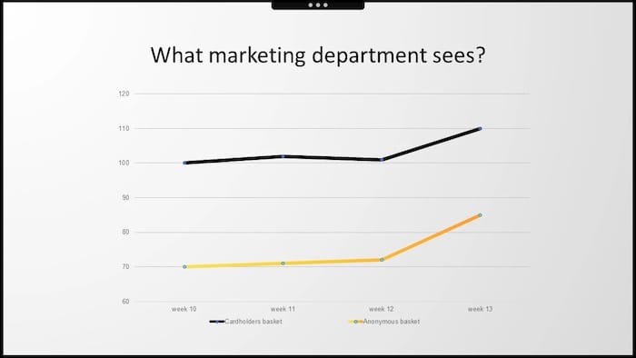
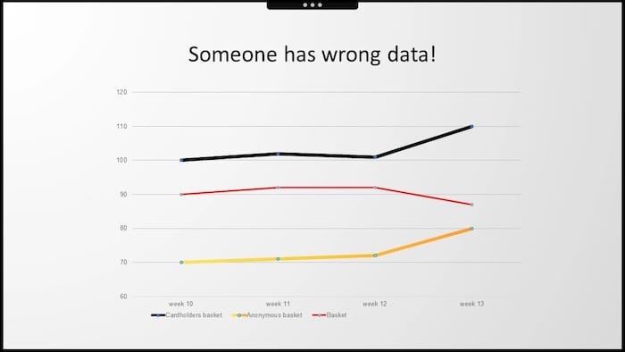
But then, the CEO of our customer presented his slide. He had some serious disappointment when looking at week 13. He focused on the presented indicator from the helicopter view, which was always essential for him - the average receipt value.

When they combined their charts, it seemed obvious that something was terribly wrong with the data. Someone messed up the report for sure. It was time to stop the meeting and get back once our agency delivered a document that no longer contradicted internal company data.
I was the one to receive that call that put our cooperation at serious risk. I listened carefully and immediately apologized as it must have been a dummy mistake in the report.
Then we started to verify it. We opened the file. We got the raw data. We recalculated everything, but as we looked deeper, the more everything seemed correct.
Apparently, we weren't the only ones to have this "WTF "moment.

A similar situation occurred to British scholars who, in 1988, published the outcomes of their study comparing treatments for kidney stones. They were particularly interested in checking if either of them is better in treating particular types of kidney stones.
They found, which is obvious looking at this table, that Treatment A was superior in both groups, both for the treatment of small and large kidney stones. But when they combined both groups, Treatment B performed better.

This phenomenon of reversing the trend that appears in subgroups and disappears when these groups are combined is called the Simpson's paradox.
It was first described in the early 1950s by British statistician Edward Hugh Simpson. He started his career as a code breaker at Bletchley Park, where he worked on breaking the enigma code along with Alan Turing.
So whenever you see Homer Simpson again, think about Edward Simpson or at least about the Simpson's paradox. That's why in our case, both basket values (with/without card) went up. But because the share of transactions without a card increased significantly, the average basket's result of the whole decreased in the end.
Let me take you on the next journey with another hero – Linda.
What a hipster girl can teach you about data samples testing
Linda is 31. She's single, outspoken, very bright, and majored in philosophy. She was deeply concerned with discrimination and social justice issues as a student. Also, she actively participated in anti-nuclear demonstrations.
Looking at this description, which statement is more probable?
A. Linda is a bank teller.
B. Linda is a bank teller, and she's also active in the feminist movement.
85% of people presented with Linda's story said that it was more probable that she was both a bank teller and an active feminist, which is a little counterintuitive, right?
Because when you look at these two groups, the group of bank tellers must be greater or, in a strictly mathematical sense, not smaller than the group of bank tellers who also happen to be active in the feminist movement - as in the presented diagram.

Daniel Kahneman, who worked together with his friend Amos Tversky, created such an experiment and investigated the human mind's biases and fallacies. So if you haven't read "Thinking Fast and Slow," which summarizes their scientific path to the Nobel Prize in economics, I strongly recommend it.

What does it have to do with loyalty data analytics? Two things for sure. With a growing number of dimensions, people tend to include all possible variables in models. They are rather suspicious when we try to simplify the model.
Many of our customers feel the need to have over-complicated data dashboards and explanations. And many loyalty managers have an unhealthy pleasure from slicing the datasets into a few segments and drawing far-reaching conclusions from there.
They even end up dealing with rabbit holes like tiny micro-segments that are so carefully crafted but not actionable in any way. But on the other hand, they ask us why we need all those numbers if we use just regression with few coefficients and variables.
And that's the difficult art of separating signals from noise. There's a famous saying that we often use: "if you torture the data long enough, it will confess to basically anything."
So when you meet a hipster girl again, remind yourself of sample data for hypothesis testing - carefully revised according to size, definition, and meaning of data-driven results.
Now let's take a ride with our ultimate hero, Frank.
What Frank Underwood can teach you about data plotting
Frank is pragmatic. Everyone who's ever watched "House of Cards" knows that the only metrics he cares about are numbers. And actually, we often do the same whenever we analyze aggregates or statistics.
We try to picture the world behind us. So imagine the following.

You analyzed the receipt data of a British discount retailer. On average, people buy 9 items during a transaction spending seven and a half pounds.
We have standard deviations for both variables. We know the formula for linear regressions. All properties and values are available to describe this phenomenon, right? So which is it? Which chart is defined by those metrics?

Let's say your boss wants you to increase the average number of items bought by customers to 10. When looking at Chart 1 - it seems doable, but when looking at Chart 4 - rather impossible.

The problem is that all four datasets can be described with the same statistics. But as you can see, looking at the data's visual distribution, the plot dots' configurations are completely different.
Again, as with Simpson, it's not really about our guide – Frank Underwood, but a different Frank. His name was Frank Anscombe, and in 1973 he drew those four charts to remind us about the importance of plotting the data.
So if there is one thing that Frank can teach you: always try to plot the data. Don't rely on statistics and aggregates.

Summary
This is the end of our data science journey guided by our three heroes. I hope that the next time when you see Homer Simpson, a hipster girl, or Frank Underwood, they will remind you of the following:
- The trend may revert. When you combine the data from groups, you may see discrepancies.
- Watch out for small sample conclusions that you try to extrapolate to big groups.
- No matter what, try to plot the data.
Big data exploration through loyalty data analytics can fuel your brand with meaningful knowledge and enable you to adapt your strategy to any circumstances.

